Analysing BEAST output using Tracer
The first section of this document provides a step-by-step tutorial to analysing the output of BEAST in a GUI application called Tracer 1.7. In a second section, a step-by-step tutorial will show the possibilities of a release candidate of TreeTracer - also a GUI application - to inspect convergence and mixing in posterior tree space.
Running Tracer
The exact instructions for running Tracer differs depending on which computer you are using. Please see the README text file that was distributed with the version you downloaded. Once running, Tracer will look similar irrespective of which computer system it is running on. For this tutorial, the Mac OS X version will be shown but the Linux and Windows versions will have exactly the same layout and functionality.
Note that loading extremely large output files into Tracer may cause it to become unresponsive.
Should that be the case, we suggest to allocate more memory to Tracer, which can be done by running Tracer from command line (e.g. using the tracer.jar in the lib folder of the Tracer download).
For example, to allocate 4Gb of memory to Tracer, run the following from command line:
java -Xmx4096m -jar tracer.jar
Data set information
For this tutorial, if you have it available, you can use the log file as well as the trees file that you created in the first tutorial.
Here, we use Tracer 1.7 to infer the spatial dispersal and cross-species dynamics of rabies virus (RABV) in North American bat populations. The data set consists of 372 nucleoprotein gene sequences (nucleotide positions: 594–1353) and comprises a total of 17 bat species sampled between 1997 and 2006 across 14 states in the United States (Streicker et al., Science, 2010, 329, 676-679). Following Faria et al. (Phil. Trans. Roy. Soc. B, 2013), two additional species that had been excluded from the original analysis owing to a limited amount of available sequences, Myotis austroriparius (Ma) and Parastrellus hesperus (Ph), are also included here. We also include a viral sequence with an unknown sampling date (accession no. TX5275, sampled in Texas from Lasiurus borealis). A uniform prior specification for the age of TX5275 adequately is used in our inference, based on the assumption that its sampling time is bounded by the sampling time distribution of the data set, implying that it is sampled between 1997.5 and 2005.5. We estimate RABV ancestral locations and host-jumping history using a Bayesian discrete phylogeographic approach with BSSVS (Lemet et al., 2009), while simultaneously estimating effective population sizes over time through a Bayesian skygrid coalescent model (Gill et al., 2012).
The main Tracer panel
To load the BEAST log file(s), select the Open option from the File menu or drag and drop the log file into the Tracer window. The file will load and you will be presented with a window similar to the one below. Remember that BEAST is a stochastic program so the actual numbers will not be exactly the same.
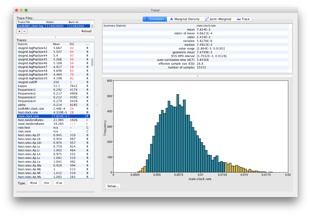
On the left hand side is the name of the log file loaded and the traces that it contains. There are traces for the posterior, prior, likelihood, and all the integer, categorical and continuous parameters that are being estimated. Selecting a trace on the left brings up analyses for this trace on the right hand side depending on the tab that is selected and the parameter type (Real/Integer/Categorical). In the figure above, the state.clock.rate trace is selected and various statistics of this trace is shown under the Estimates tab.
Note that the Effective Sample Sizes(ESSs) for many of the traces are small (ESSs less than 100 are highlighted in red by Tracer). This indicates that the current analysis did not yet yield a sufficient number of independent samples from the posterior distribution for that parameter. A low ESS means that the trace contained a lot of correlated samples and thus may not represent the posterior distribution well. In the bottom right of the window is a frequency plot of the samples.
In the top right of the window is a table of calculated statistics for the selected trace. The statistics and their meaning are described in the table below.
Mean- The mean value of the sampled trace across the chain (excluding the burn-in).
Stdev- The standard deviation of the mean. This takes into account the effective sample size so a small ESS will give a large Stdev.
Median- The median value of the sampled trace across the chain (excluding the burn-in).
95% HPD Lower- The lower bound of the highest posterior density (HPD) interval. The HPD is a credible set that contains 95% of the sampled values.
95% HPD Upper- The upper bound of the highest posterior density (HPD) interval. The HPD is a credible set that contains 95% of the sampled values.
Auto-Correlation Time (ACT)- The number of states in the MCMC chain that two samples have to be from each other for them to be uncorrelated. The ACT is estimated from the samples in the trace (excluding the burn-in).
Effective Sample Size (ESS)- The ESS is the number of independent samples that the trace is equivalent to. This is essentially the chain length (excluding the burn-in) divided by the ACT.
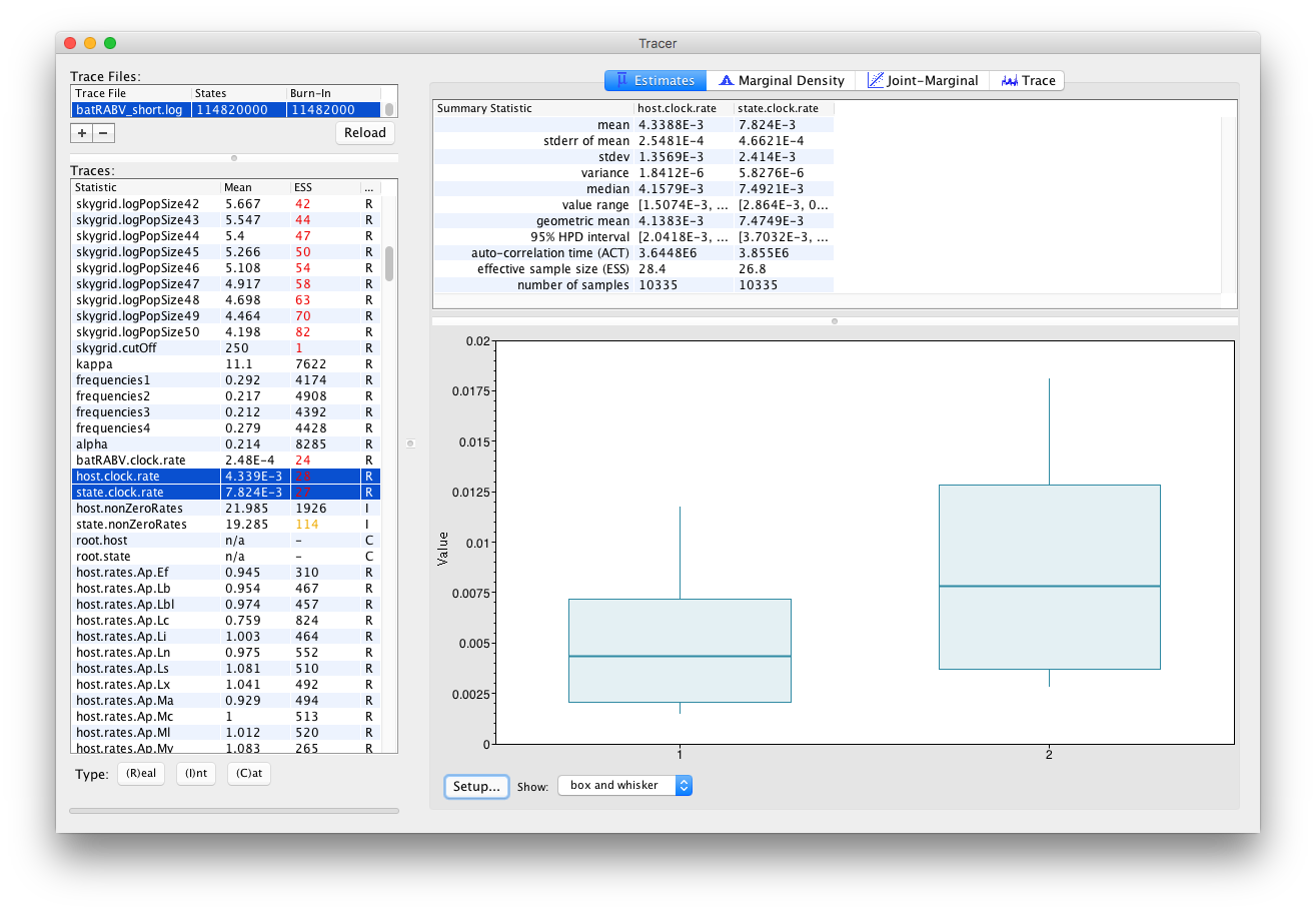
Selecting two parameters in the left column creates (by default) box and whisker plots for continuous parameters:
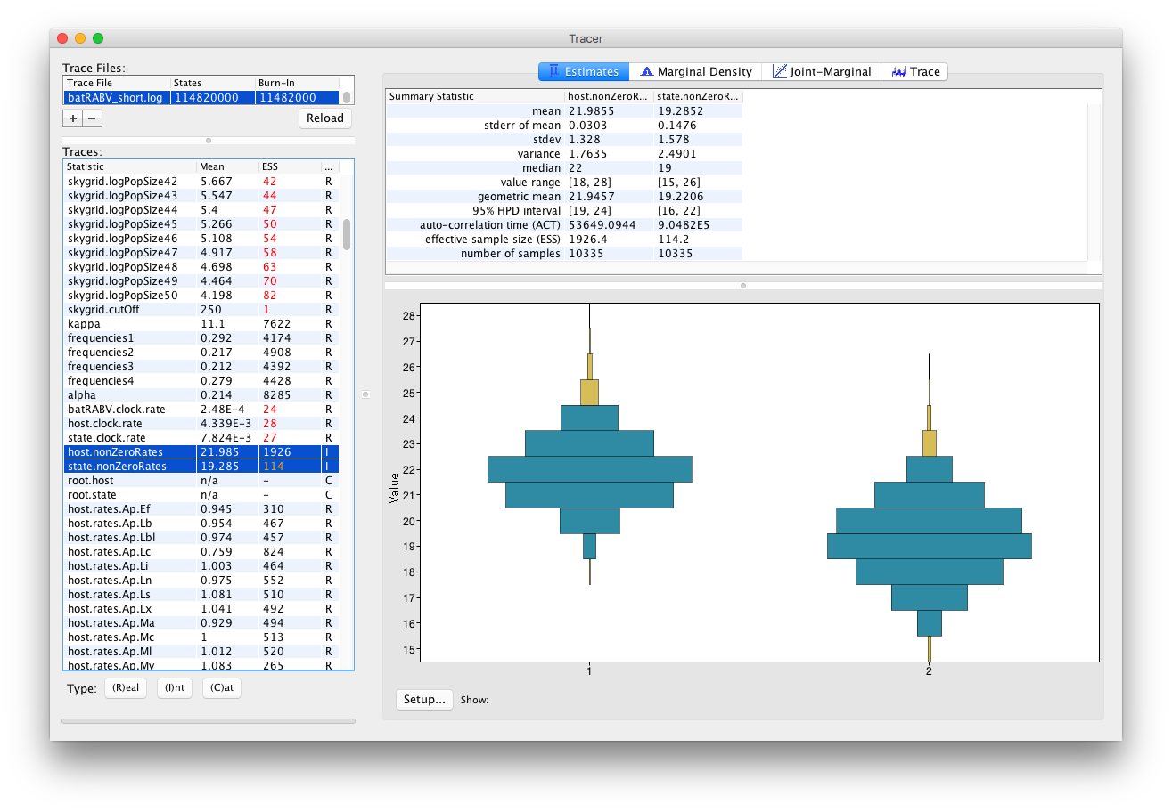
An alternative visualization is available when selecting multiple parameters of the Integer trace type:
The Trace panel
If we select the Trace (panel) we can view the raw trace, that is, the sampled values against the step in the MCMC chain:
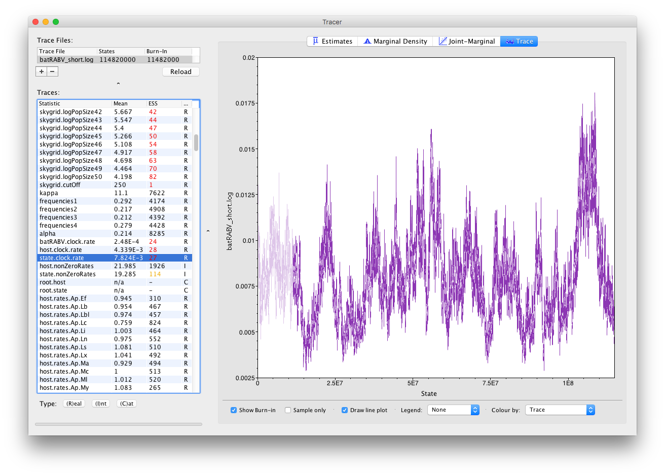
Here you can see a visual explanation of the low ESS value for the state.clock.rate parameter, with that parameter’s posterior distribution being difficult to explore. The ESS for the likelihood is about 25 so we are only getting one eighth of the amount of independent samples as actual samples. Essentially, this means we need to run the chain eight times as long to reach an ESS value of about 200. Alternatively, given that many parameters have very high ESS values (such as the kappa parameter of the HKY model), we can alter the weights on the various transition kernels to spend more time estimating the state.clock.rate parameter.
In general, substitution model parameters are fairly easy to estimate, which quickly leads to high ESS values. We can have a look at the trace of that kappa parameter to get an idea of what our trace for state.clock.rate would ideally look like (we call this plot the hairy caterpillar):
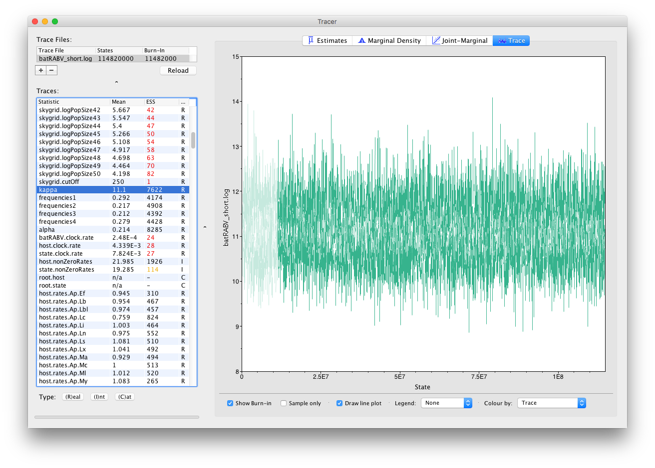
There are no obvious trends in the plot suggesting that the MCMC was still converging and there are no large-scale fluctuations in the trace suggesting poor mixing. Diagnosis of trace plots will be dealt with in a another tutorial.
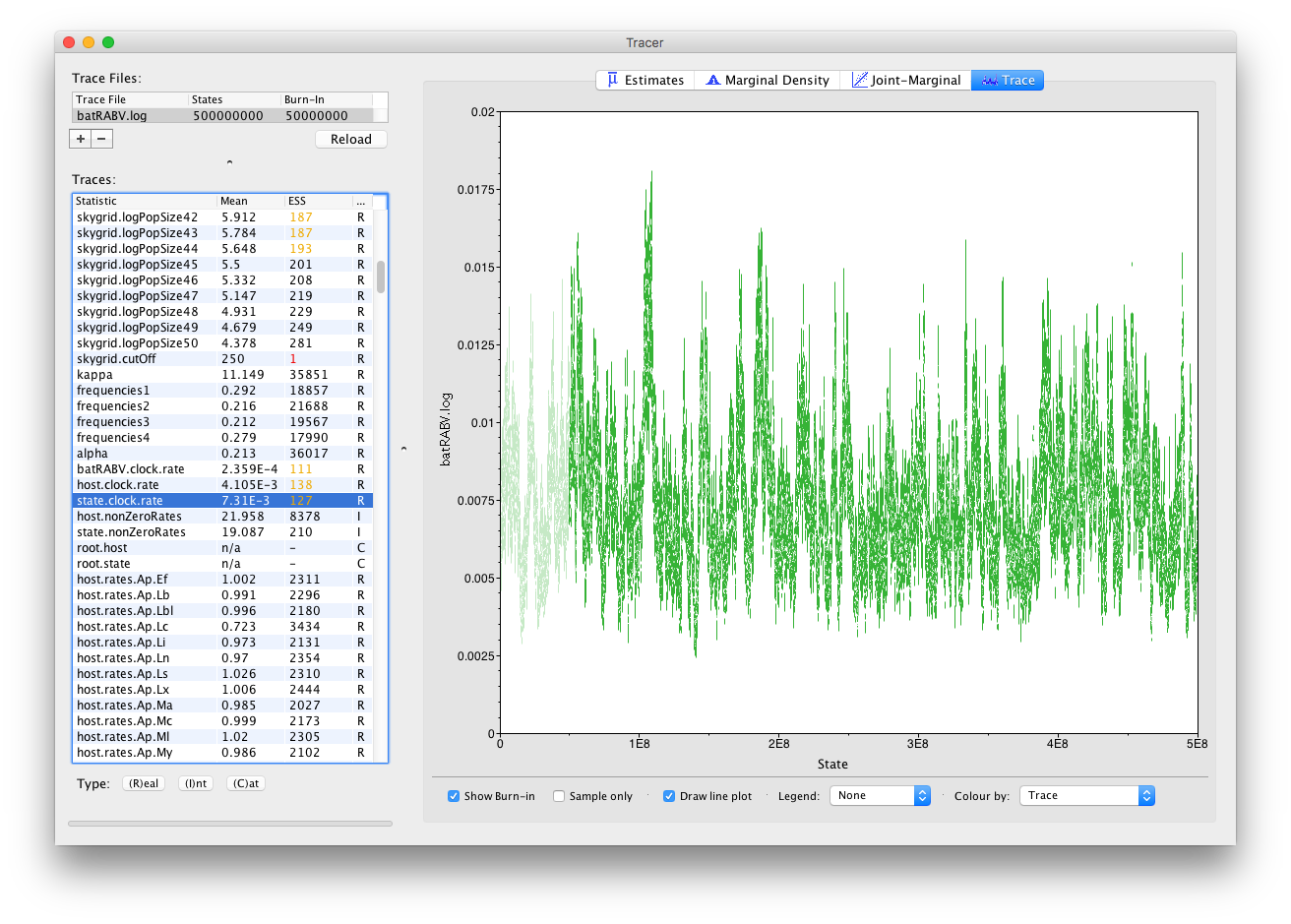
Now, let’s run our XML for about 5 times as long for a total of 500 million iterations and have a look at the state.clock.rate parameter again. This already looks much better, with its ESS value having increased by about 5, which is reflected in the trace:
It’s also straight forward to visualize the tracer for multiple parameters at the same time. Simply selecting those parameters in the left column will take care of this:
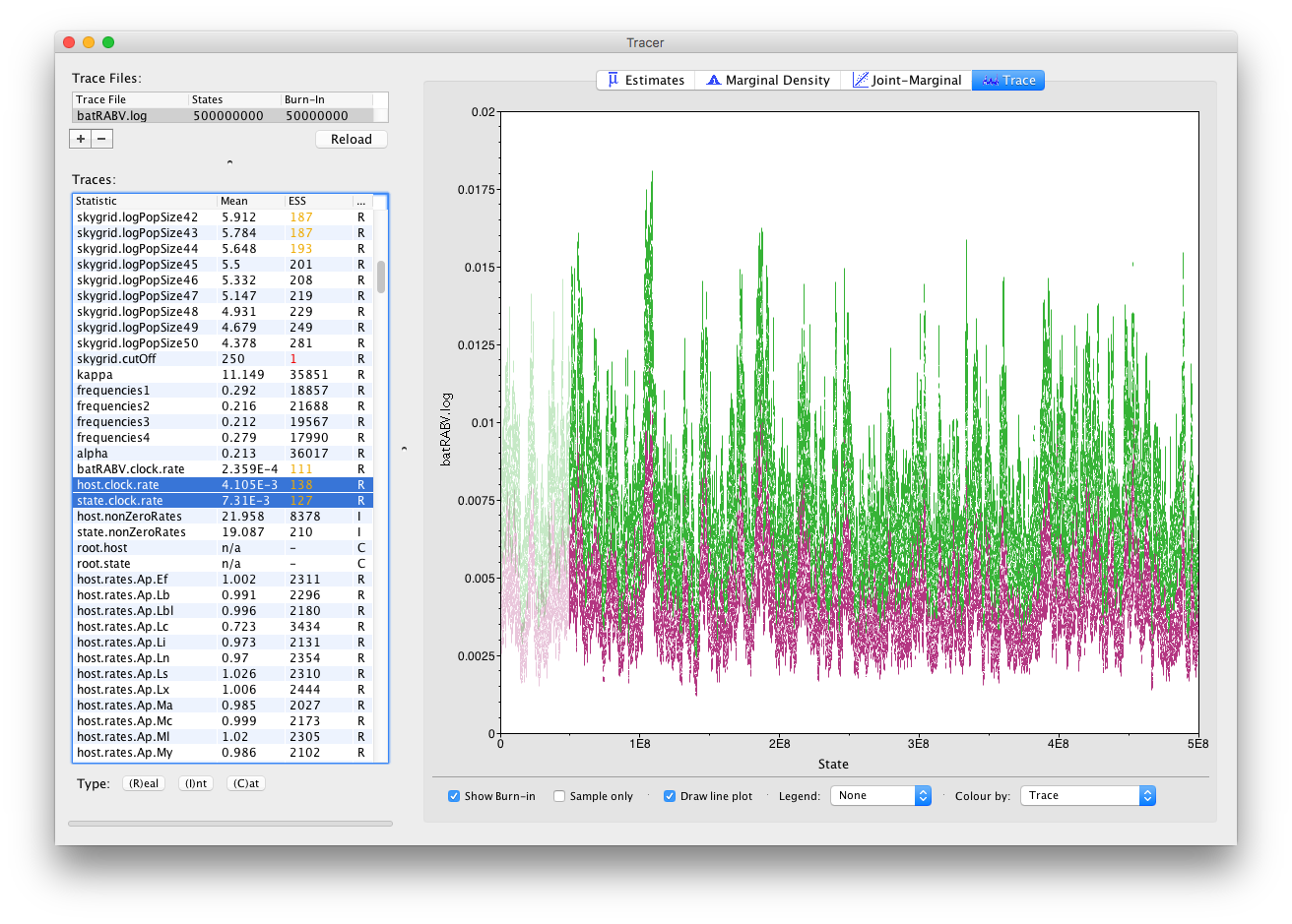
Notice how all the other parameters now also show (much) increased ESS values, such as for the population size parameters of our skygrid model. Most of those parameters have ESS values of about 200, meaning there is still auto-correlation between the samples but 200 effectively independent samples is fairly acceptable. Note that, while this analysis consists of multiple parameter types (Real/Integer/Categorical), ESS values only apply to Real (or continuous) parameters.
A separate reference page on ESS values and how to increase them is available.
The Marginal Density panel
Keeping our selection of two parameters (host.clock.rate and state.clock.rate) and switching to the Marginal Density panel provides us with the following kernel density plot:
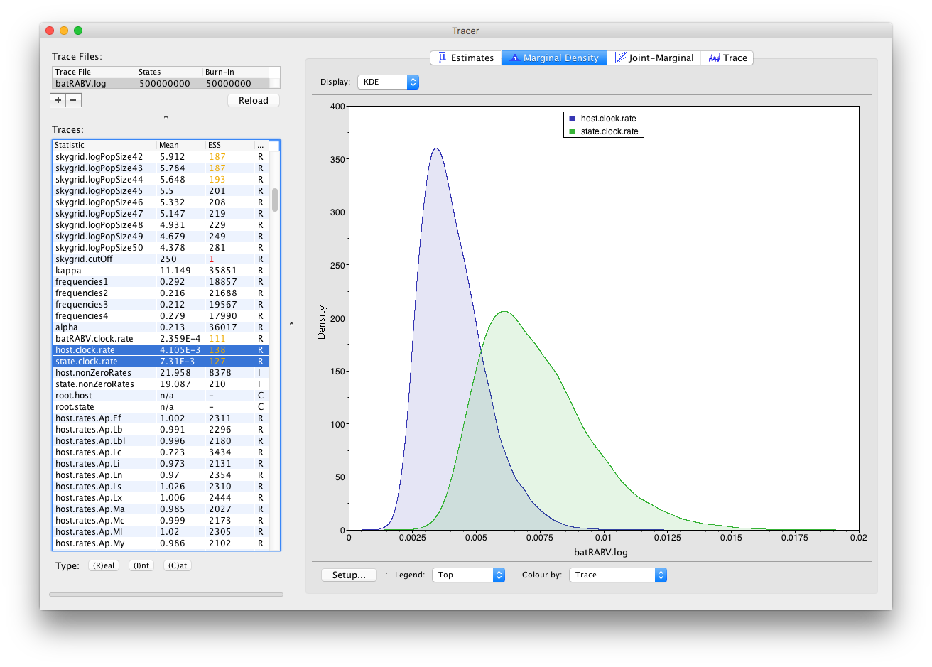
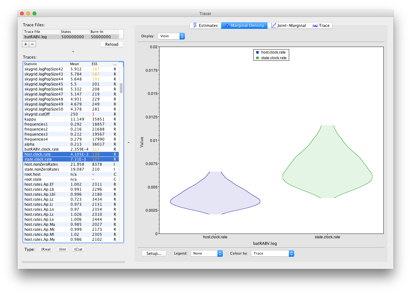
It’s convenient to switch between these kernel density plots and other visualization options, such as histograms and violin plots for continuous parameters. For example, a violin plot of our two currently selected parameters shows the following:
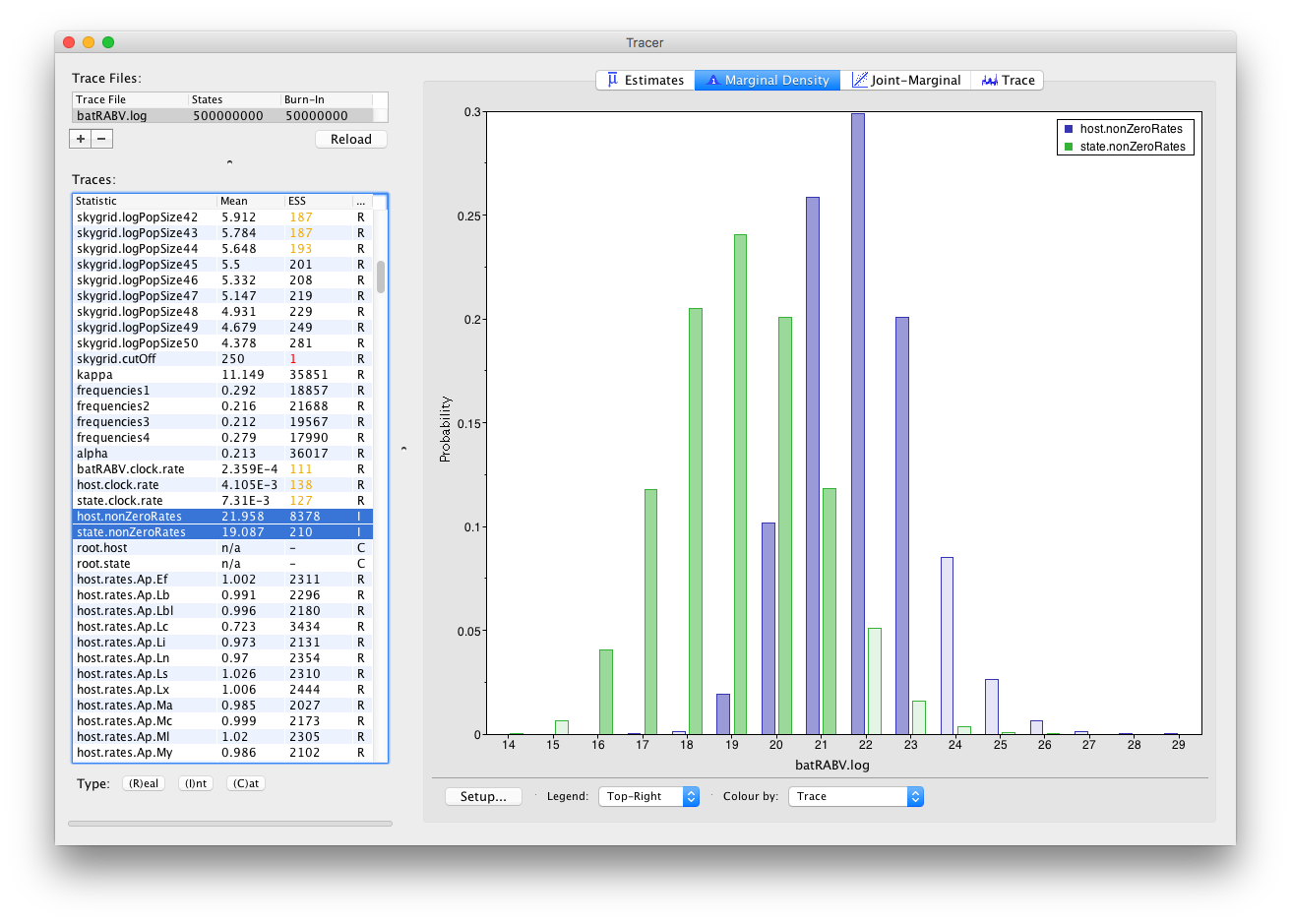
Frequency plots are used to visualize (multiple) parameters of the Integer type:
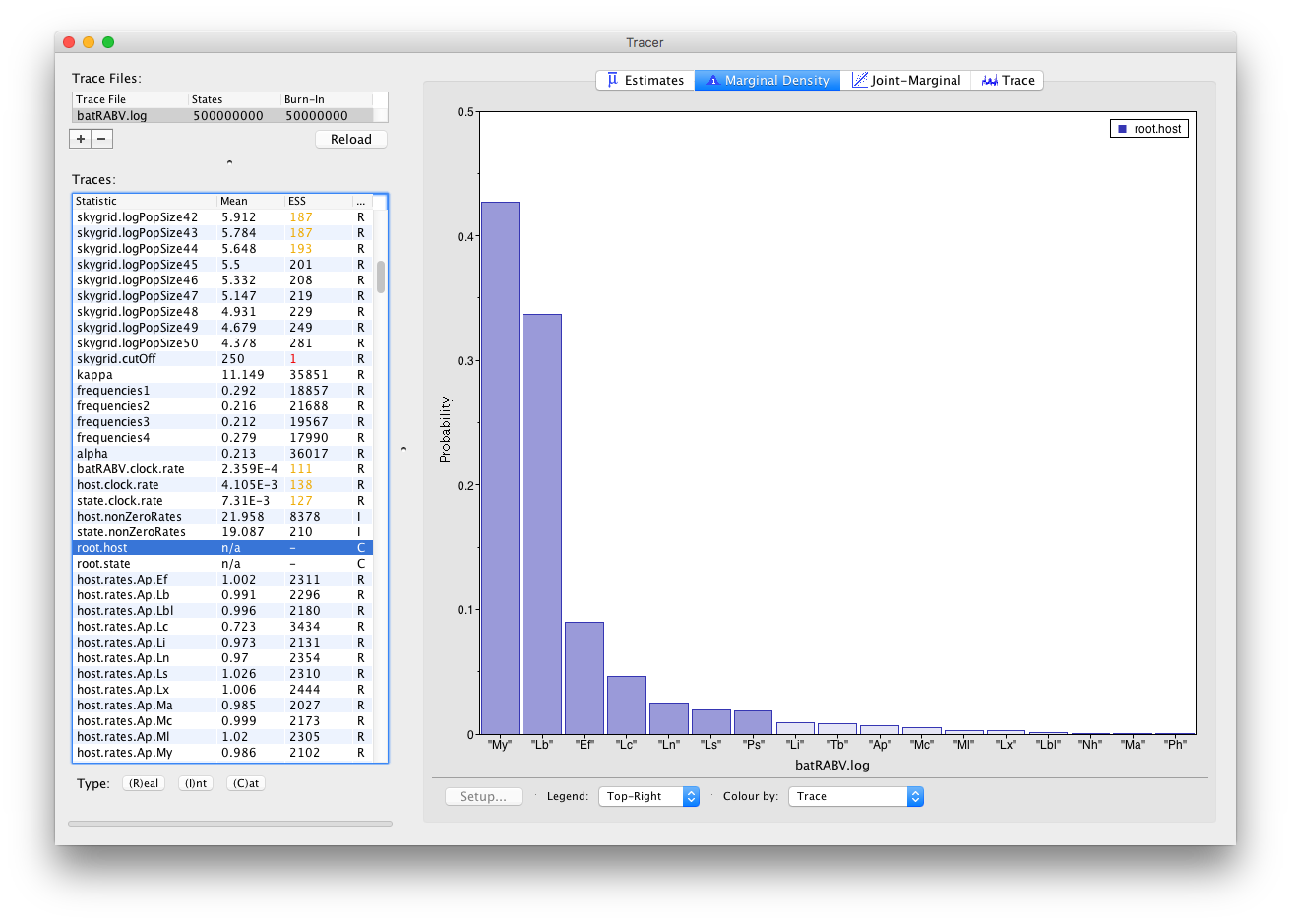
Histograms are used to visualize a parameter of the Categorical type:
The Joint-Marginal panel
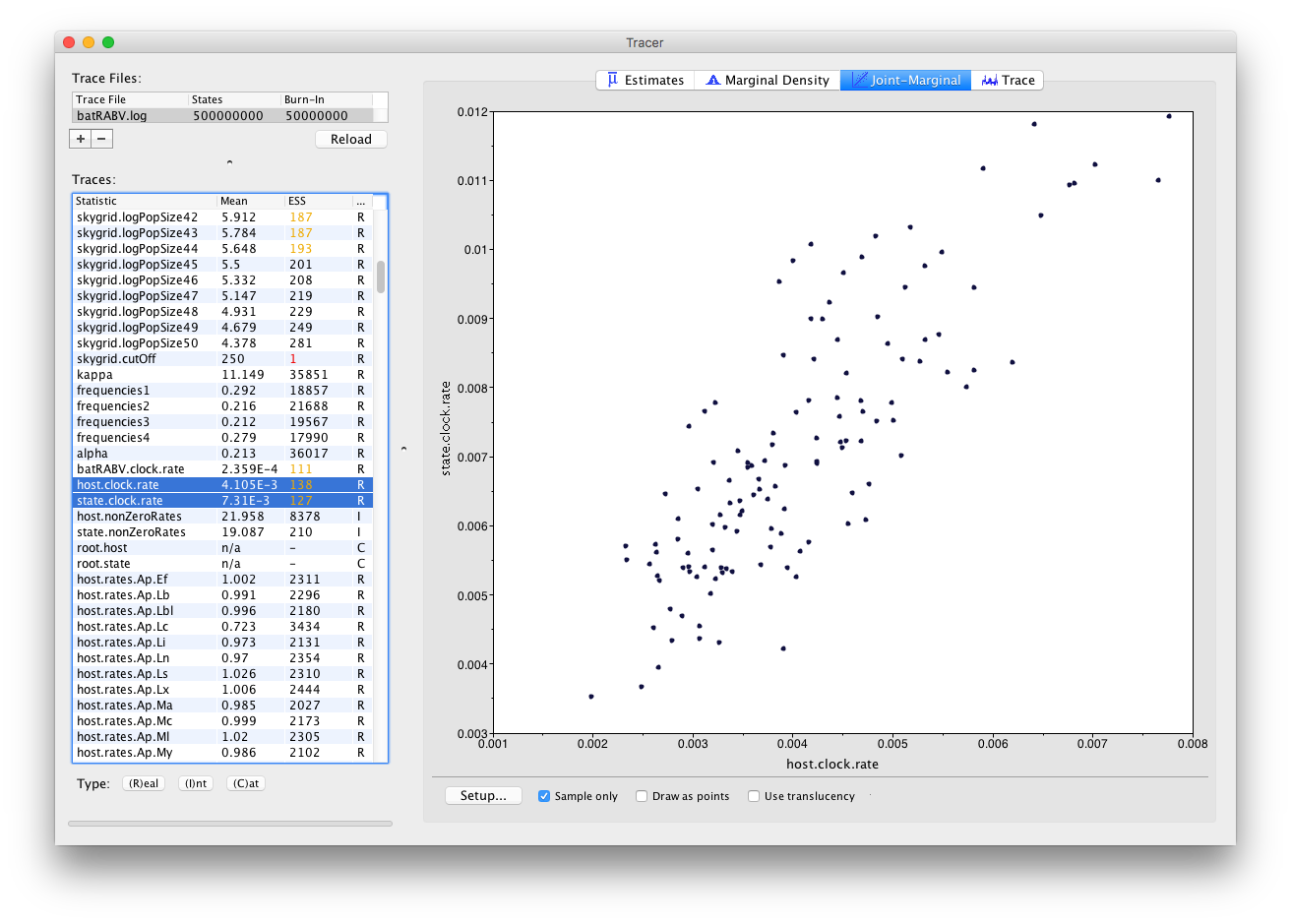
Much like the Marginal Density panel, the visualization options in the Joint-Marginal panel depend on the trace type of the selected parameter(s). Selecting two continuous (or Real) parameters leads to a classic scatter plot being shown, allowing to assess the correlation between those parameters:
When multiple continuous (or Real) parameters are selected, extensions for correlations using large correlation matrices are used (Murdoch and Chow; 1996):
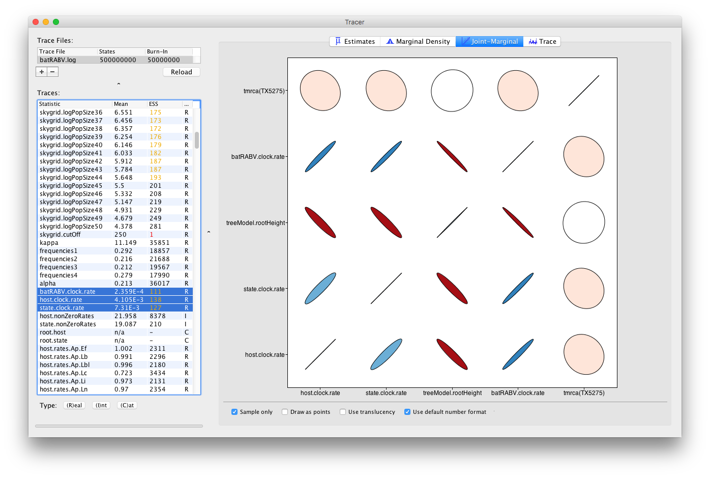
Colour gradients indicate strength and direction of the correlation, from red (strong negative) to blue (strong positive). Ellipse shapes re-enforce the strength of correlation, with no correlation appearing as a circle and perfect (anti-)correlation as a line.
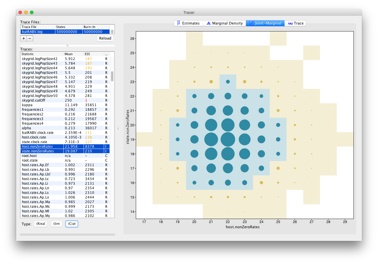
For Integer parameters, selecting exactly two parameters yields a visualization of the joint probability distribution of those two integer variables through a bubble chart:
Tracer 1.7 also allows selecting parameters of different trace types, such as one Integer and one Real parameter:
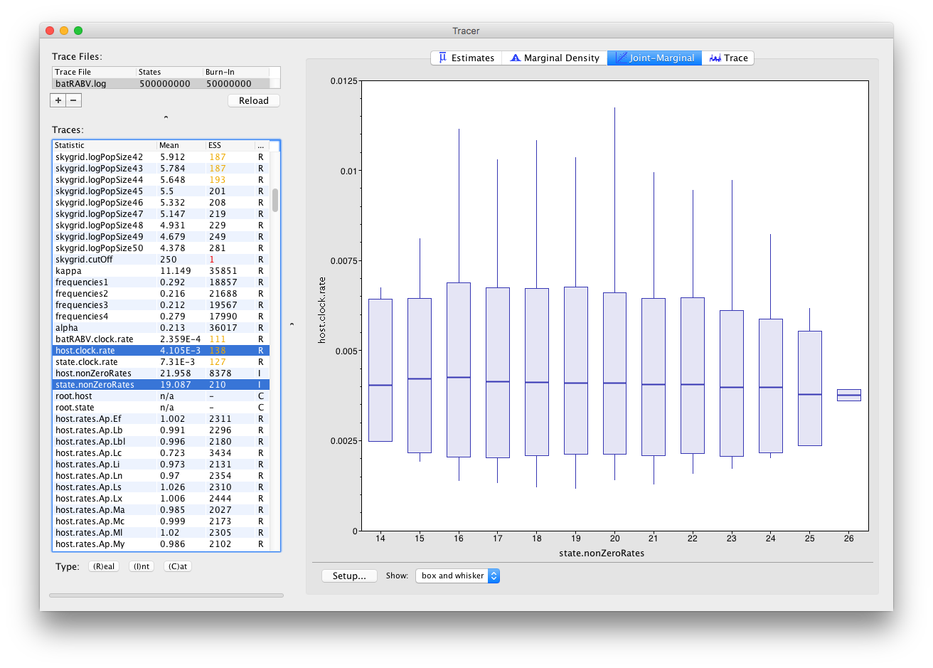
This draws one box and whisker plot for each unique value of the Integer parameter selected.
Visualizing effective population sizes over time
Tracer 1.7 provides demographic reconstruction resulting in a graphical plot, often applied to reconstruct epidemic dynamics. Available models are constant size, exponential and logistic growth (Drummond et al., 2002), and the non-parametric Bayesian skyline (Drummond et al., 2005; Heled and Drummond, 2008), skyride (Minin et al., 2008) and skygrid (Gill et al., 2012). Note that a separate page is available on the various possible tree priors in BEAST.
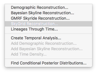
For the data analysis in this tutorial, the non-parameter skygrid coalescent model (Gill et al., 2012) was used and we show here how to perform a demographic reconstruction. In the Tracer menu bar, select Analysis which will show the following options:
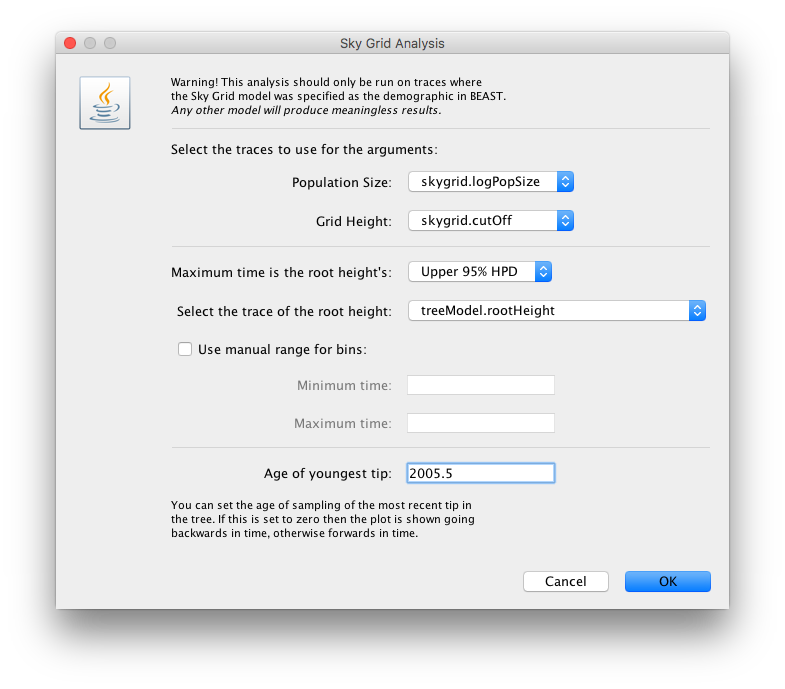
The next window allows setting various options, but typically only the ‘Age of the youngest tip’ needs to be provided:
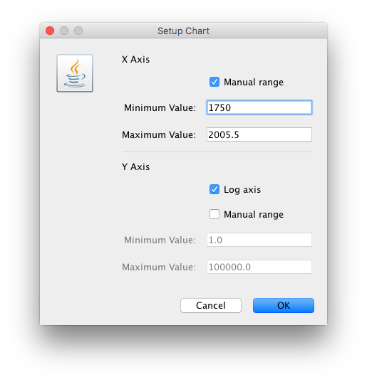
For this data set, we advise to manually set the range of the X axis in the graphical plot (which you can for any plot in Tracer 1.7):
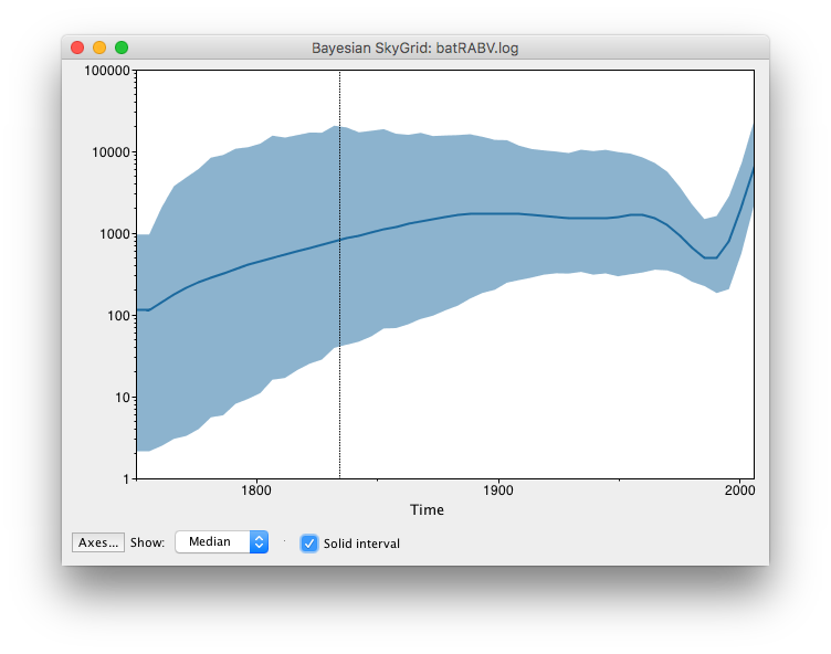
These steps allow Tracer to reconstruct the demographic history of RABV by drawing the effective population sizes over time. RABV has successfully established itself in North American bat species, with its effective population size rising steadily throughout recent centuries. Following a rapid decline at the end of last century, we observe a recent sharp increase in size.
Analysing BEAST output using TreeTracer
We here analyse a single trees file from a BEAST analysis in TreeTracer to inspect convergence and mixing. A follow-up tutorial will focus on comparing multiple analysis replicates to one another to check whether running the same analysis multiple times leads to consistent results.
Running TreeTracer
The exact instructions for running TreeTracer differs depending on which computer you are using. Please see the README text file that was distributed with the version you downloaded. Once running, TreeTracer will look similar irrespective of which computer system it is running on. For this tutorial, the Mac OS X version will be shown but the Linux and Windows versions will have exactly the same layout and functionality.
While we have focused TreeTracer development on computational efficiency, loading extremely large trees files into TreeTracer may cause the required calculations to become more time-consuming.
Note that the first time you start / run TreeTracer, it may take a bit of time as TreeTracer sets up its environment on your computer; subsequent times you wish to use TreeTracer will have a faster start-up process.
The main TreeTracer window
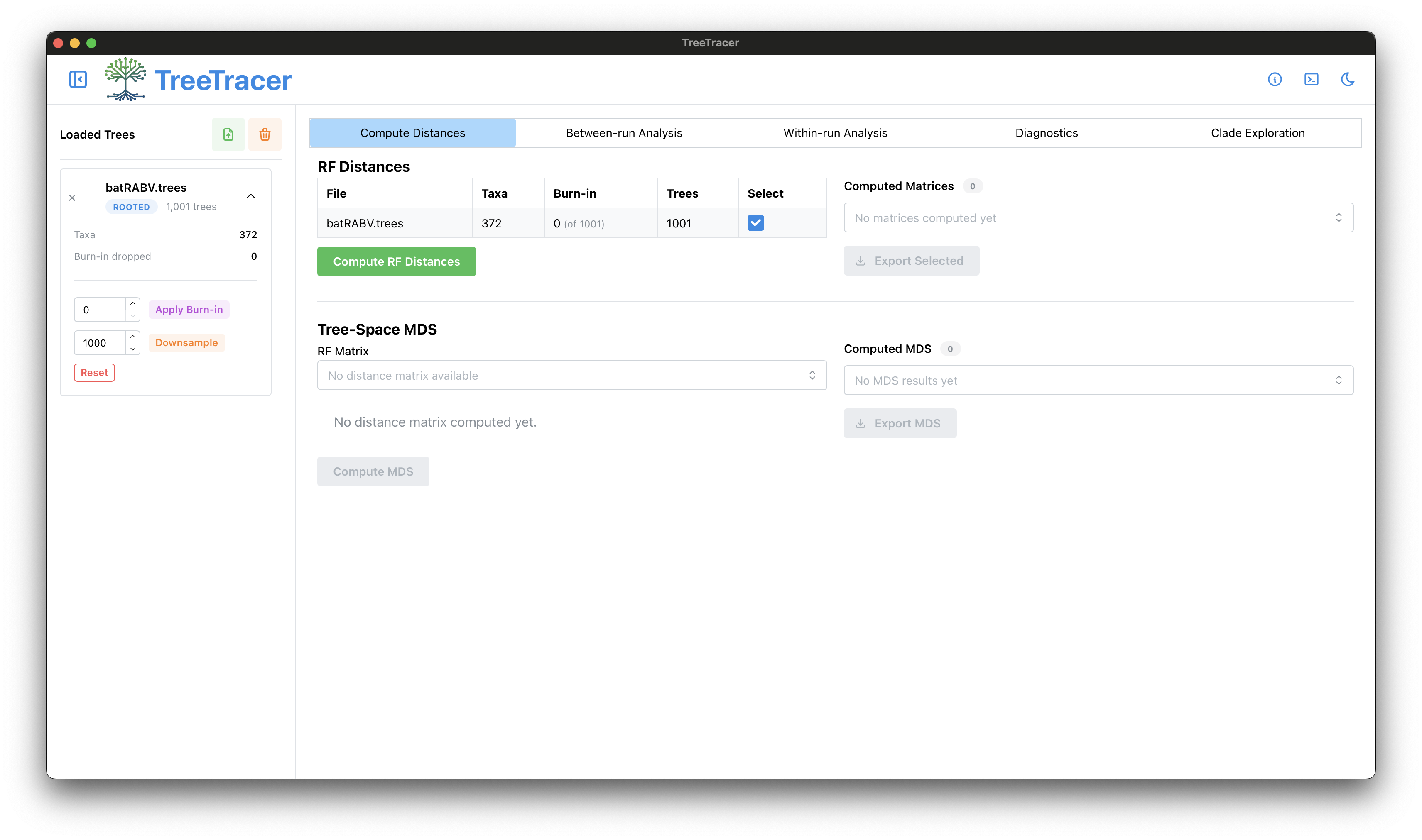
Upon launching the TreeTracer application, you will be presented with a window similar to the one below. There are already several options to modify the main TreeTracer window. For example, to the left of the TreeTracer icon, you can always choose to hide / show the sidebar. At the same height but on the far-right, you can toggle to dark mode by clicking the crescent moon icon.
The Compute Distances panel
To load the BEAST trees file(s), click the green button that also has a green arrow. Browse to the trees file you’d like to load and click Open in the file chooser window. We here load the trees output file from the bat rabies virus (RABV) analysis, to complement the Tracer analysis from the first part of this tutorial. The file will be loaded into TreeTracer and be presented to you in a collapsed view as can be seen below.
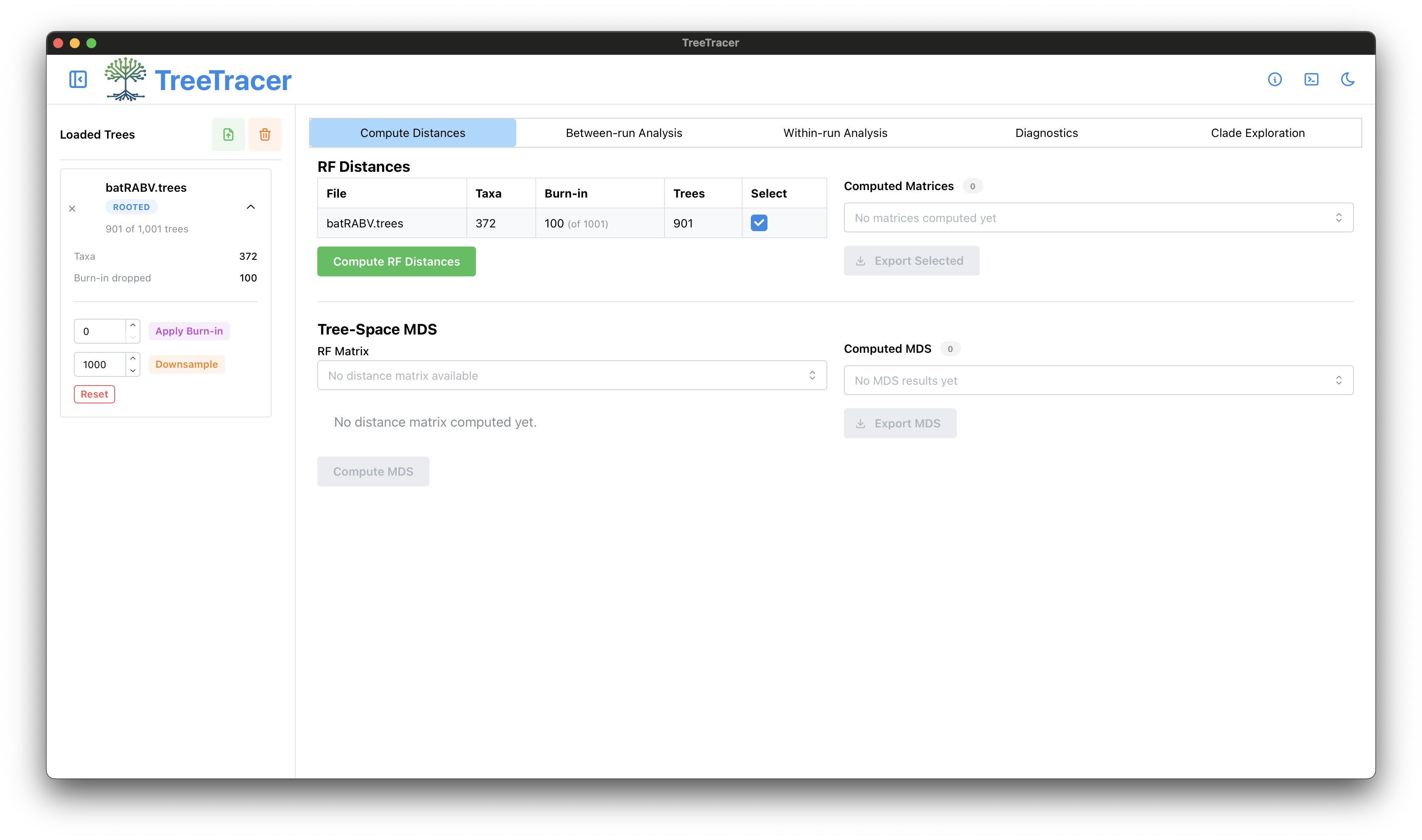
TreeTracer indicates that 1,001 trees were detected and will by default use all of these trees in subsequent calculations. As with Tracer, it’s common to make sure you inspect samples from the posterior, i.e. when the Markov chain has moved past the burn-in part of the analysis. We will start by setting a burn-in of 10% - i.e. 100 trees - by clicking the downward arrow next to the trees file that we loaded. Doing so will also reveal the possibility to downsample the number of trees in case too many were loaded. To ensure manageable computation times in TreeTracer, we suggest 1,000 trees per analysis replicate.
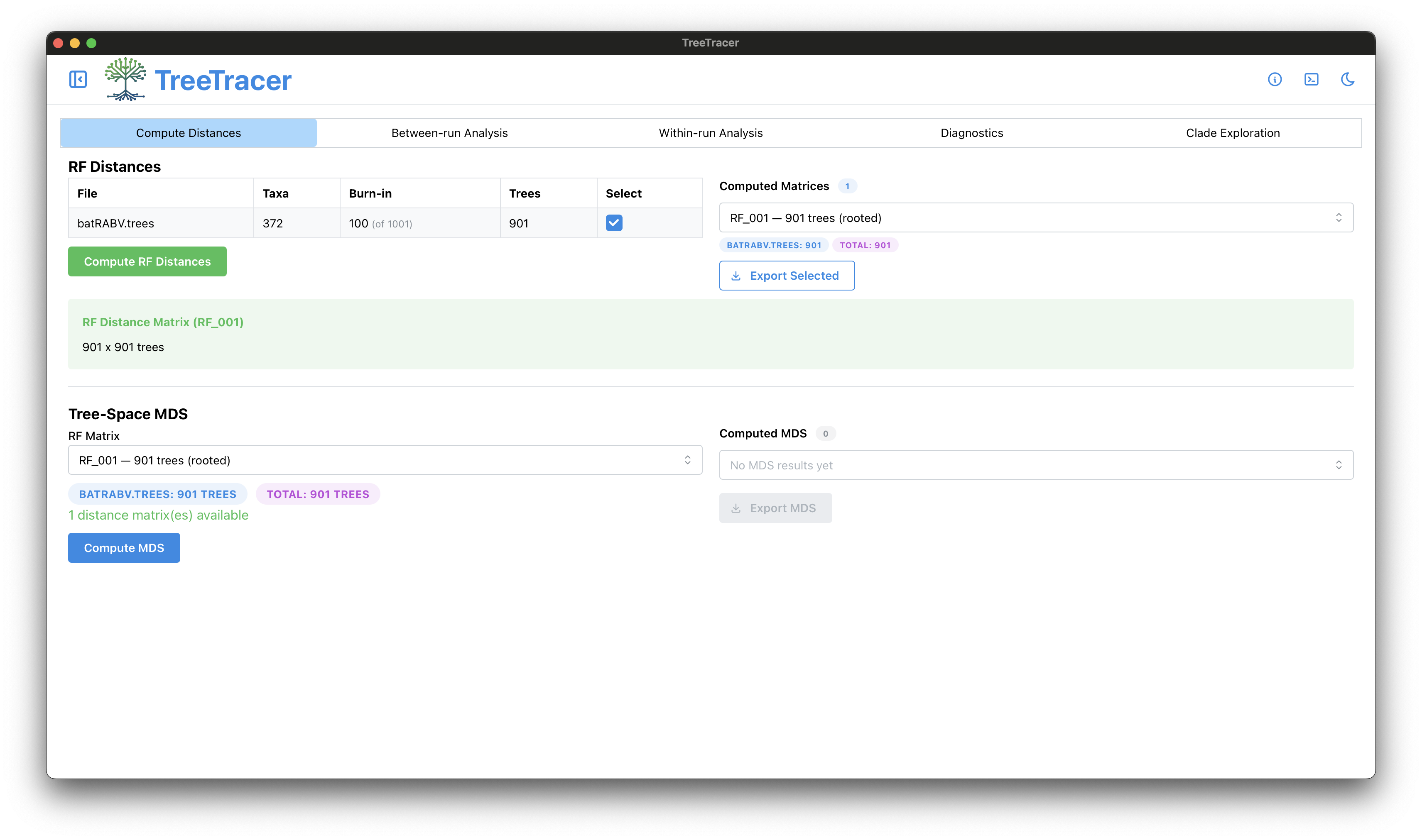
Enter 100 in the corresponding text box and click Apply Burn-in button. There is no need to downsample.
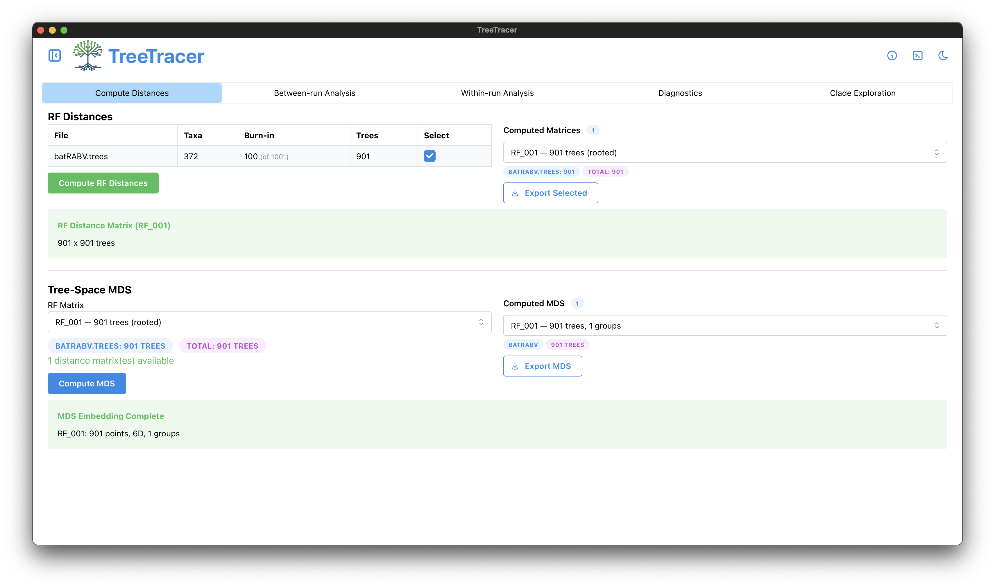
After applying the burn-in, we hence have 901 trees available as can be seen both in the left-hand panel but also in the information in the Robinson-Foulds (RF) Distances summary.
Given that the purpose of this tutorial is to inspect the output of a single BEAST run, we now clock the Compute RF Distances button to start the required calculations in TreeTracer.
When the RF calculations are done (should be quick - you will see than an RF Distance Matrix of 901 by 901 trees is now available), the sidebar on the left will be automatically toggled (you can easily get it back by click the button to the left of the TreeTracer icon) and the Tree-Space MDS information will be updated, thereby activating the Compute MDS button. We can now move forward by performing the multi-dimensional scaling (MDS) calculations, by clicking the Compute MDS button. These should also be completed quickly, after which TreeTracer will show that the MDS Embedding has been completed.
The Within-run Analysis panel
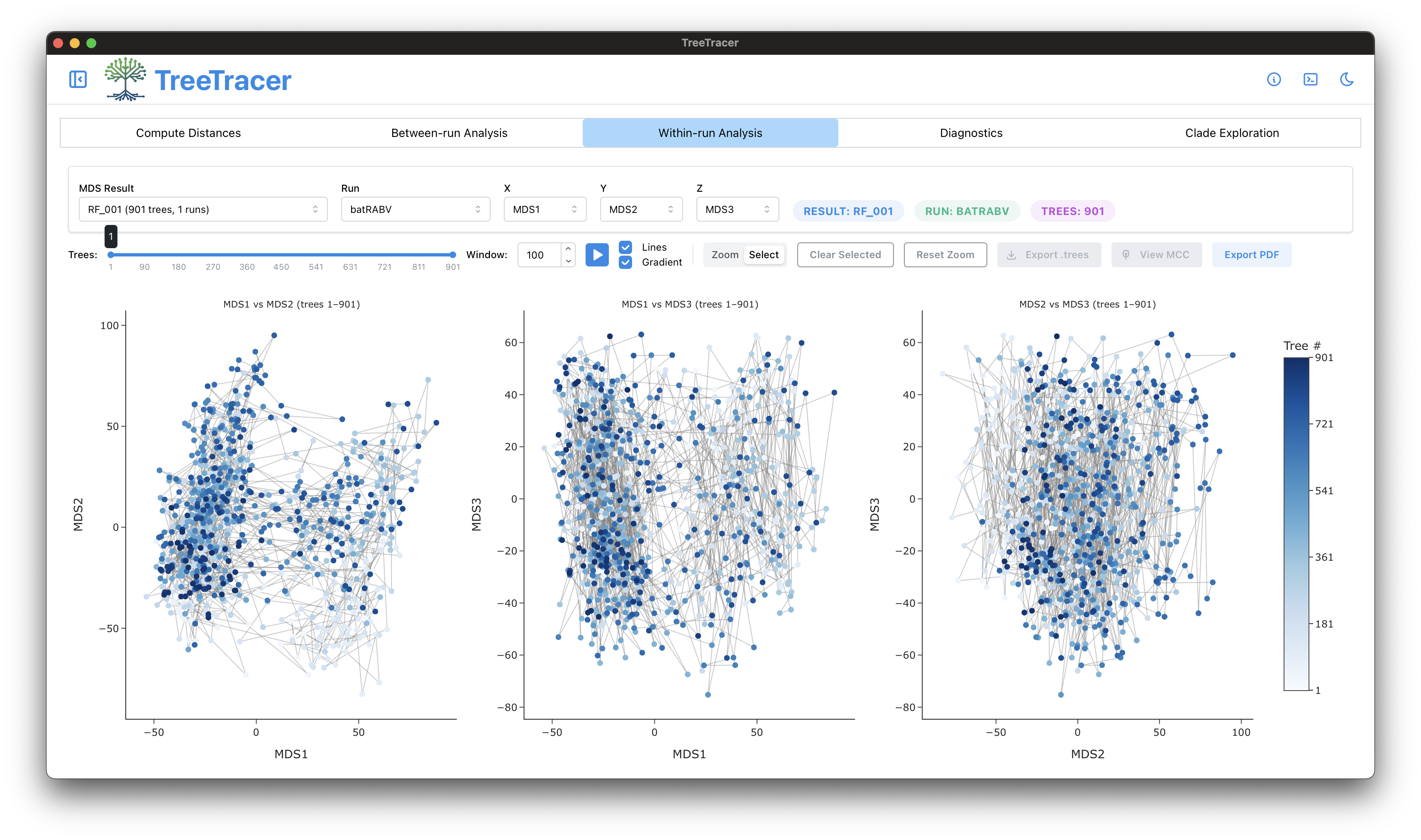
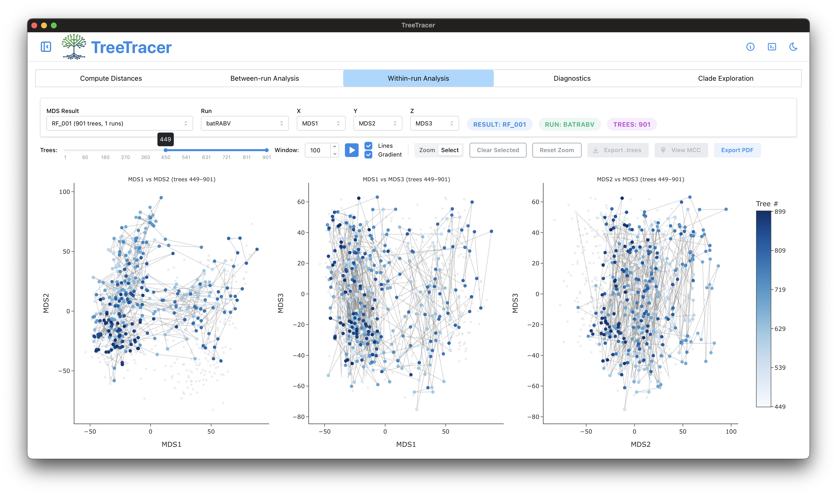
All required actions and calculations in the Compute Distances panel have now been done, and we can go on to inspect the Within-run Analysis panel. By default, the first 3 dimensions of the MDS (MDS1, MDS2 and MDS3) will be used to show three 2-dimensional visualisations, i.e. one for each pairwise MDS projection (MDS1 x MDS2, MDS1 x MDS3, and MDS2 x MDS3). All 901 trees are currently used for the MDS visualisation.
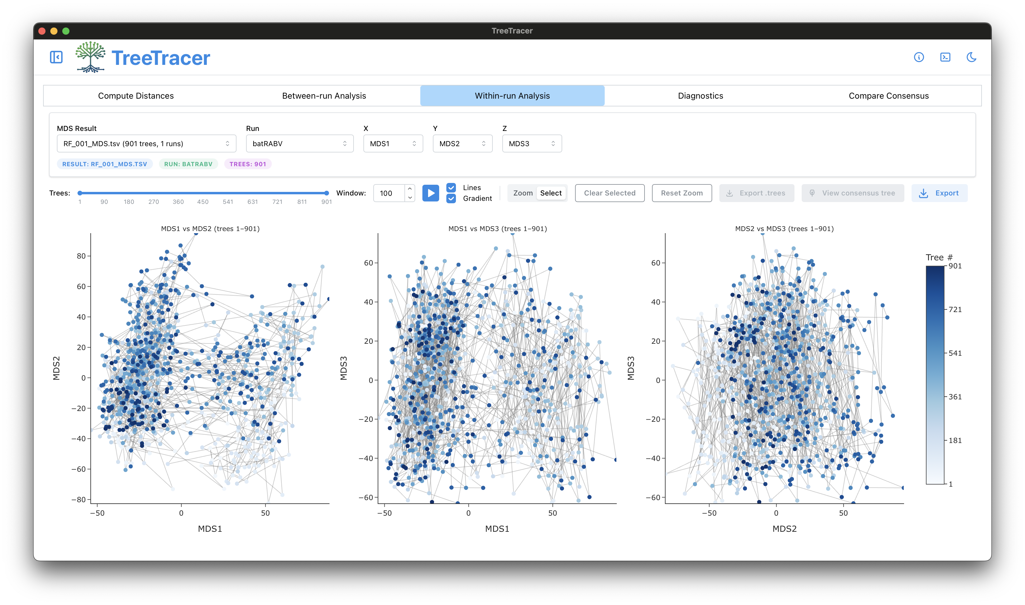
The MDS visualisations above - particularly the first two that involve MDS1 - point to bimodality in the posterior tree distribution based on the RF distance / metric. However, we first need to make sure that the smaller point cloud (on the right in the first two visualisations) does not merely constitute burn-in in tree space. We can easily move the slider to approximately half of the available MDS points (to 449 out of 901 in the figure below) to inspect this.
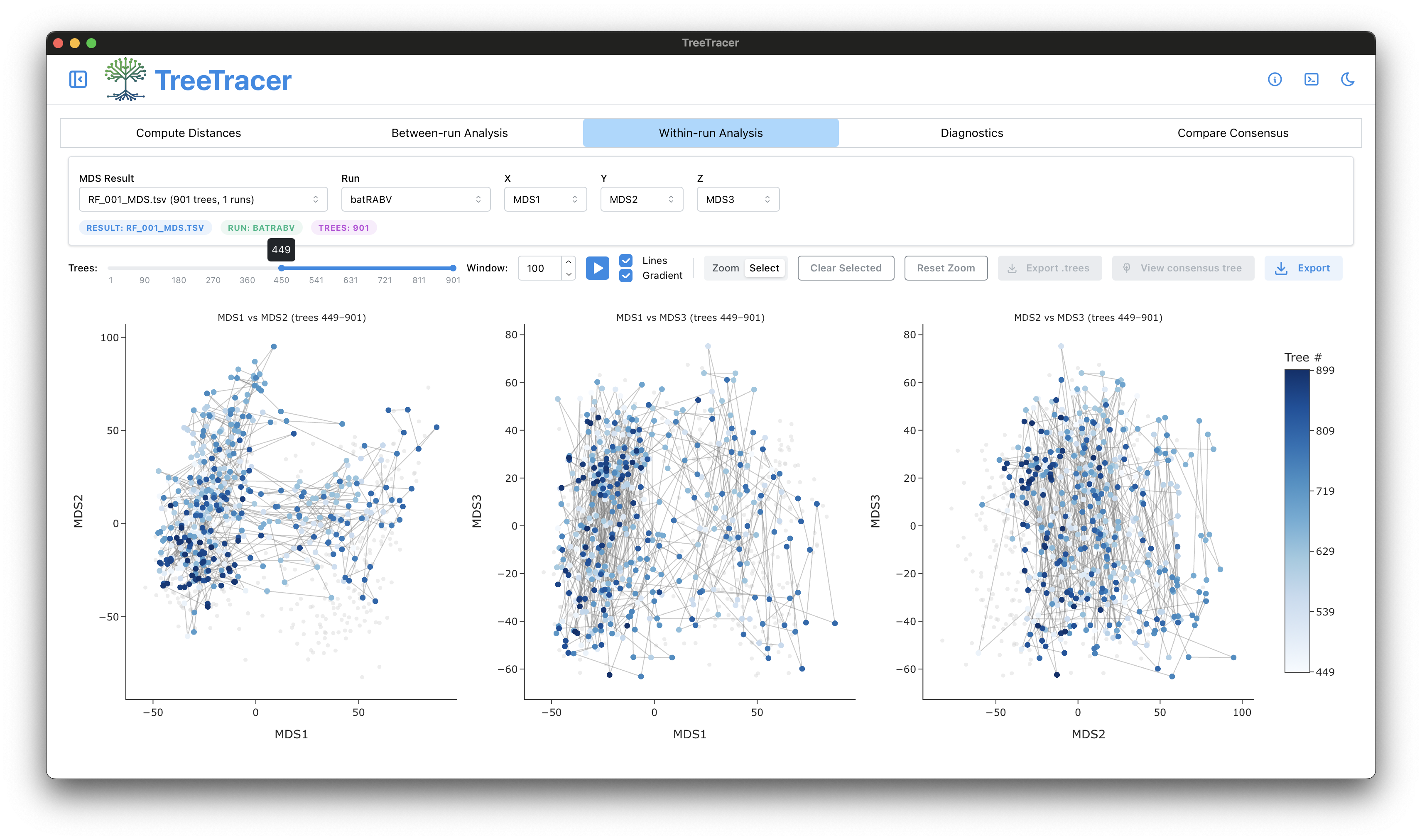
The number of points in both point clouds seem to decrease proportionally but the smaller point cloud does not disappear. The bimodality in RF space is hence not the result of burn-in, but both modes in RF posterior tree space are being sampled regularly, i.e. the Markov chain keeps going back and forth between both modes which is what you want to see. You can easily visualise a consensus tree corresponding to each mode. To do so, first draw a rectangle around the majority of points that make up the first mode.
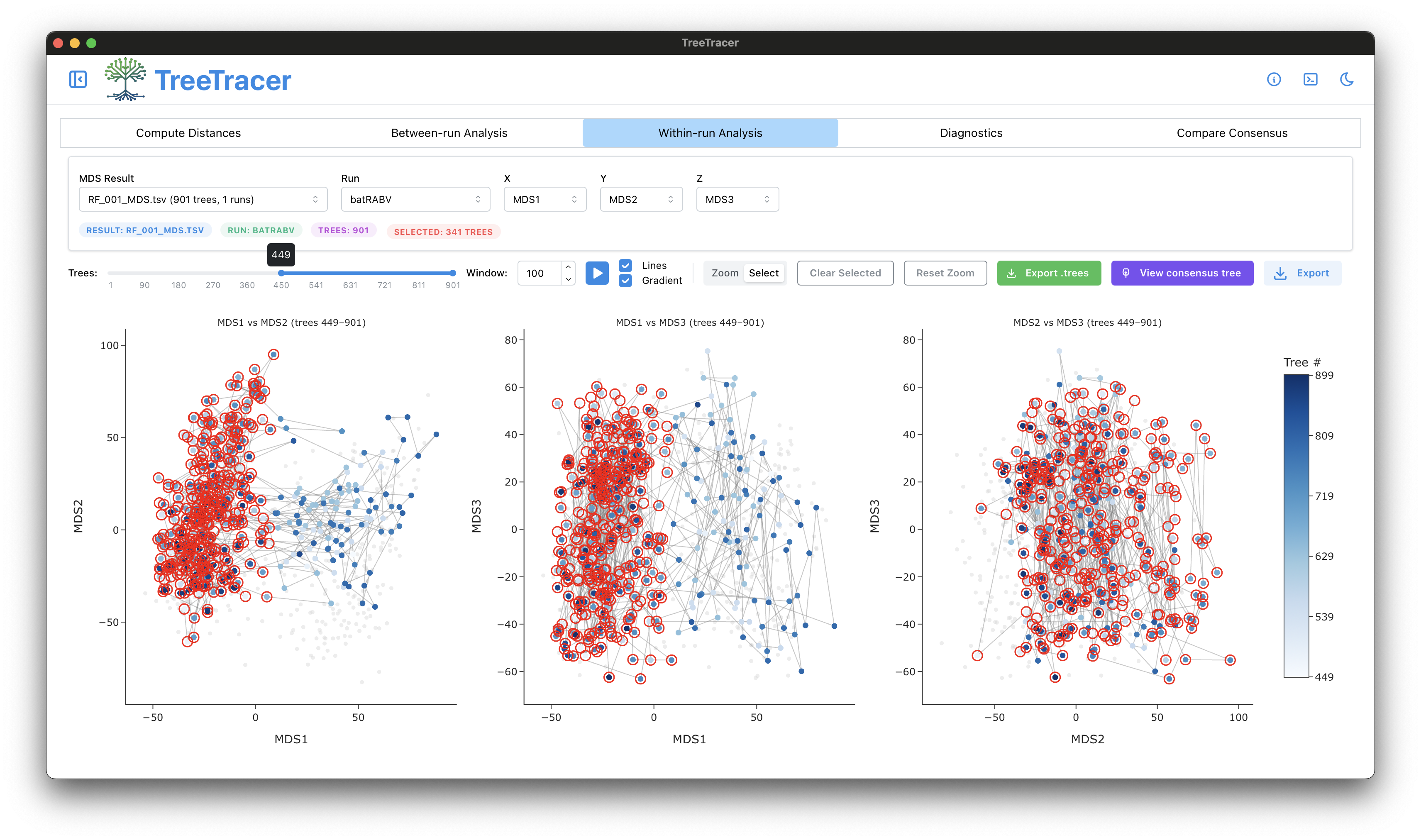
You can now click View Consensus Tree to have TreeTracer compute a consensus tree and visualise the result in a pop-up window that uses PearTree; a tutorial on how to use PearTree can be found here.
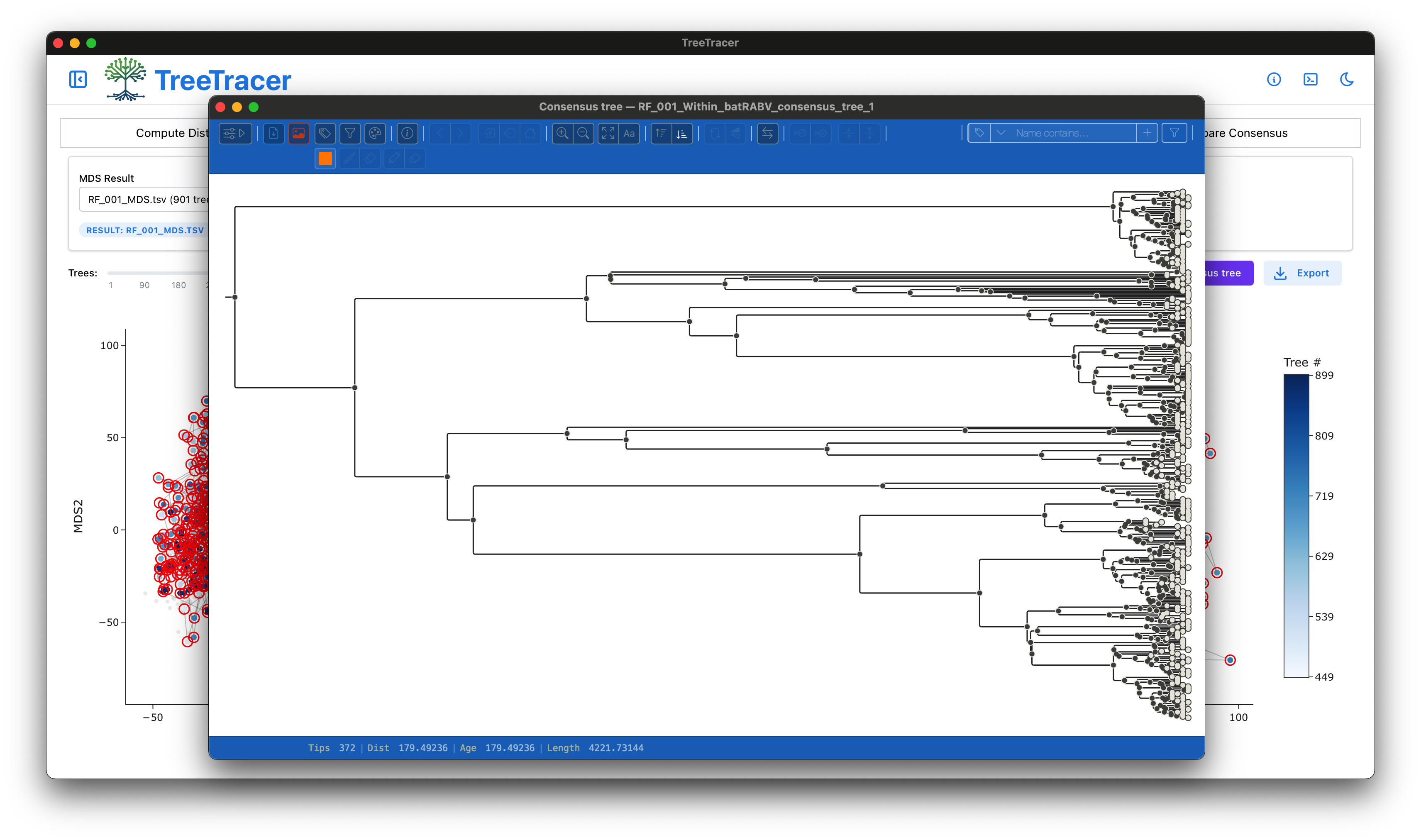
When creating the consensus tree, a pop-up window will appear that asks for a name to assign to the consensus tree for the points you have selected. You can provide a custom name or choose to accept the name suggested by TreeTracer.

If you also compute a consensus tree for the smaller point cloud and (again) accept the name provided by TreeTracer, you will see the following two consensus tree summaries appear in the Within-run Analysis panel. We will compare these two consensus trees when we discuss the Compare Consensus panel.

The Diagnostics panel
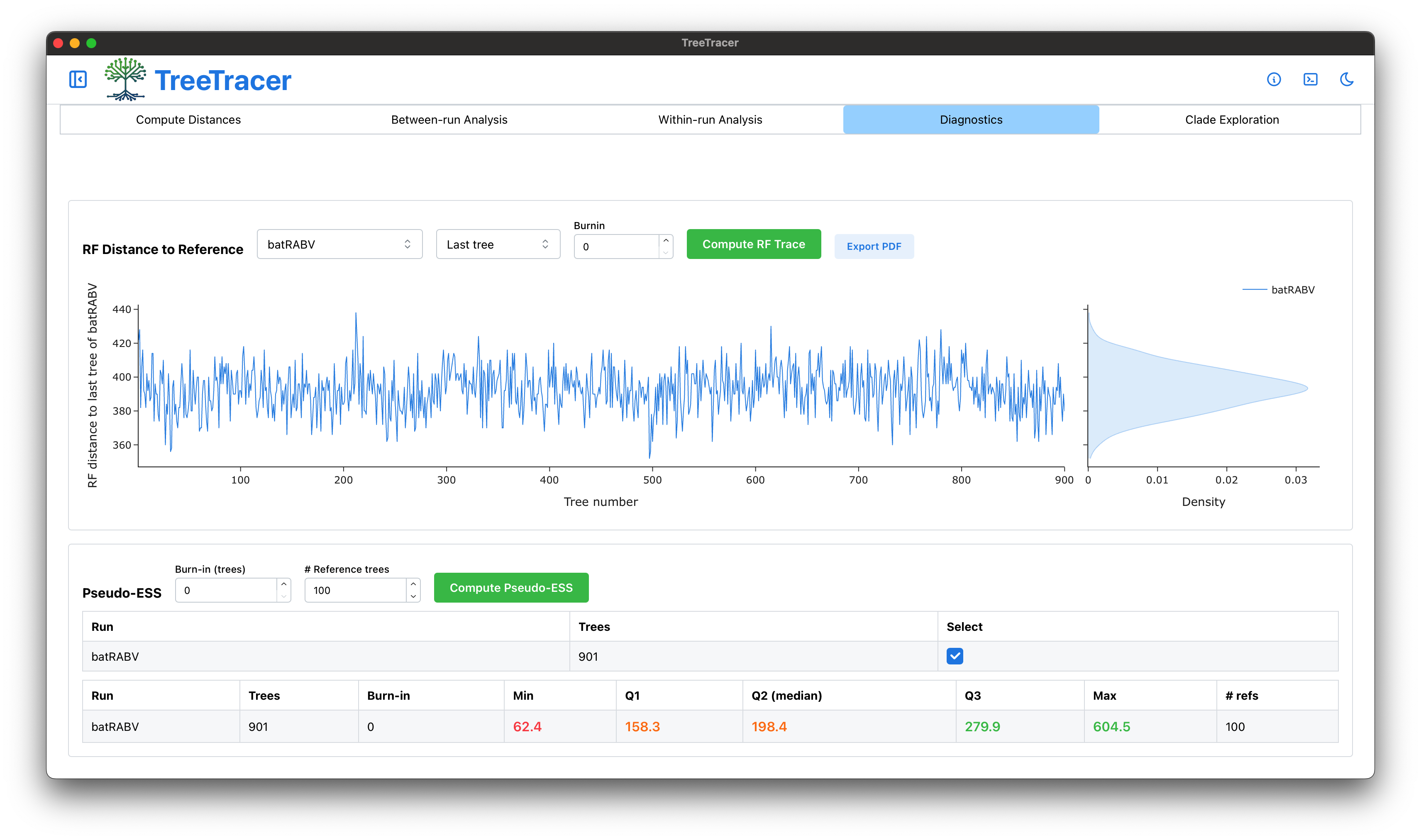
We can now transition to the Diagnostics panel, which will readily show a trace plot of the log joint density (often called the log posterior) values across the 901 posterior trees we have been working with. The main purpose of this trace plot is to double-check whether you see any patterns / jumps appear in the values shown, which is not the case here. In other words, while there are two modes in RF posterior tree space they do not have clearly different log joint density values.
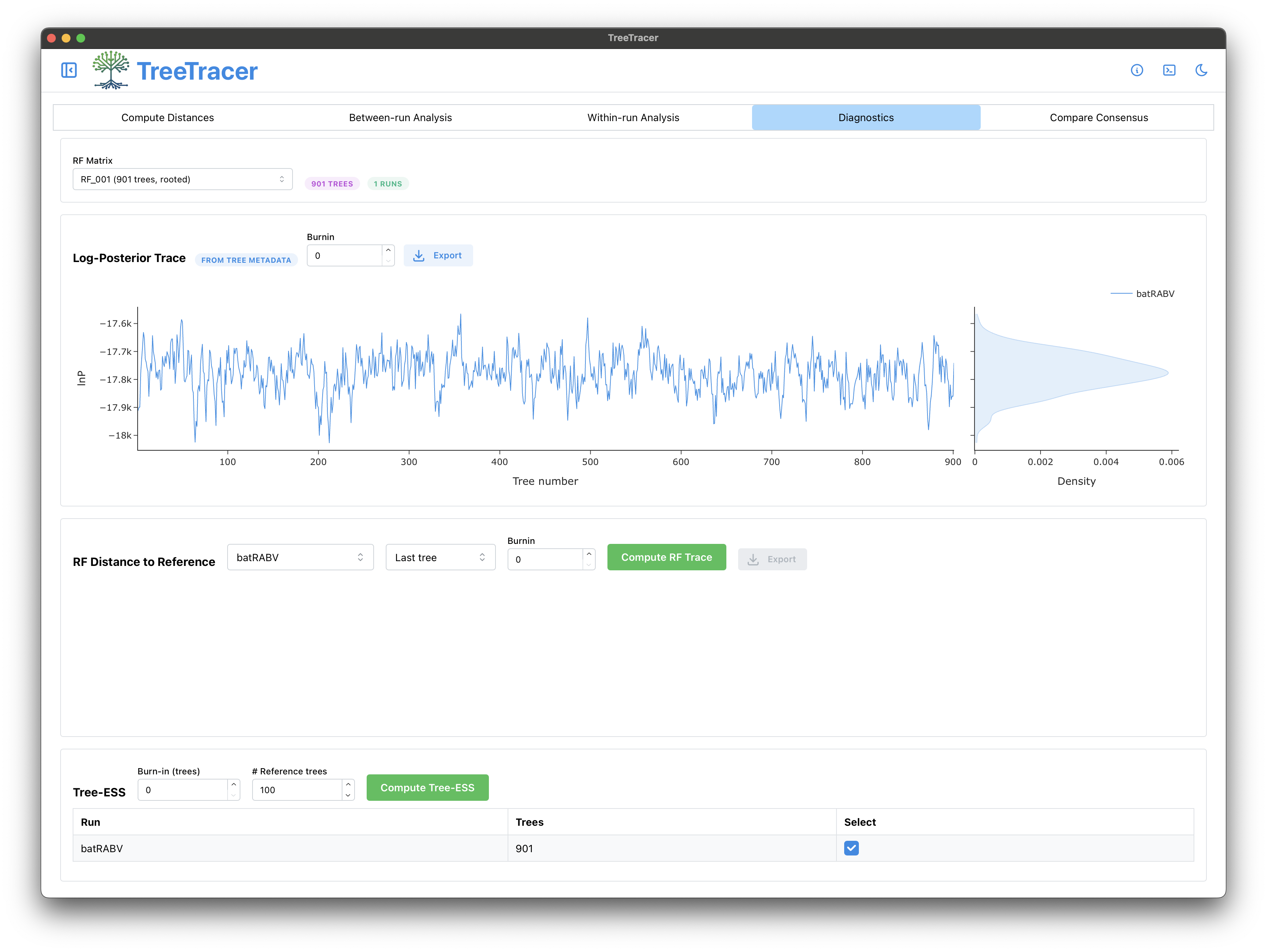
We can also have TreeTracer create a trace plot of the RF distances between the 901 trees and a reference tree of choice. Choosing the first tree sampled from the Markov chain may be a poor choice (especially if the burn-in has not been removed), and we hence keep the default choice of using the last tree sampled from the Markov chain as the reference tree. Click the Compute RF Trace button, and the RF Distance trace plot should immediately appear.
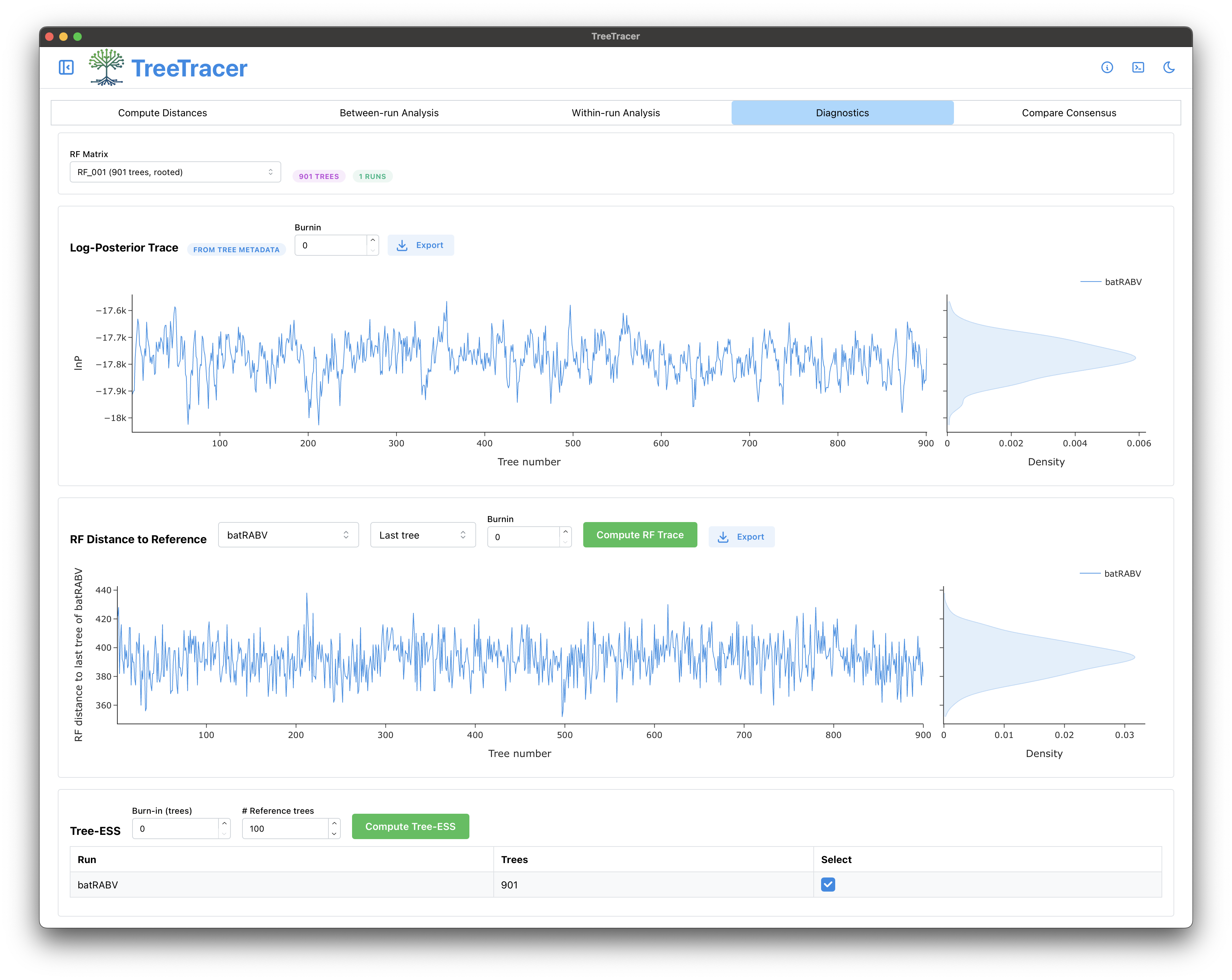
While visual exploration of tree space is highly valuable, it remains difficult to determine whether your BEAST analysis has run for sufficiently long. To this end and similar to what Tracer does, TreeTracer provides the possibility to compute a tree ESS value to determine whether your BEAST analysis has collected a sufficient number of independent samples from its posterior distribution. Click Compute Tree-ESS to start computing the tree ESS, which should be calculated relatively quickly. Interpreting the tree ESS value is currently based on the work of Magee et al. (2024) regarding the Fréchet correlation ESS approach, and our own evaluation regarding the performance of this method (Brusselmans et al., 2024). Following Magee et al. (2024), you can use a tree ESS cut-off of 500 for the Fréchet correlation ESS; TreeTracer will hence color the ESS value in black when it exceeds 500, in orange when it is between 500 and 250, and in red (indicating that you should really run your analysis for longer) when it is below 250.
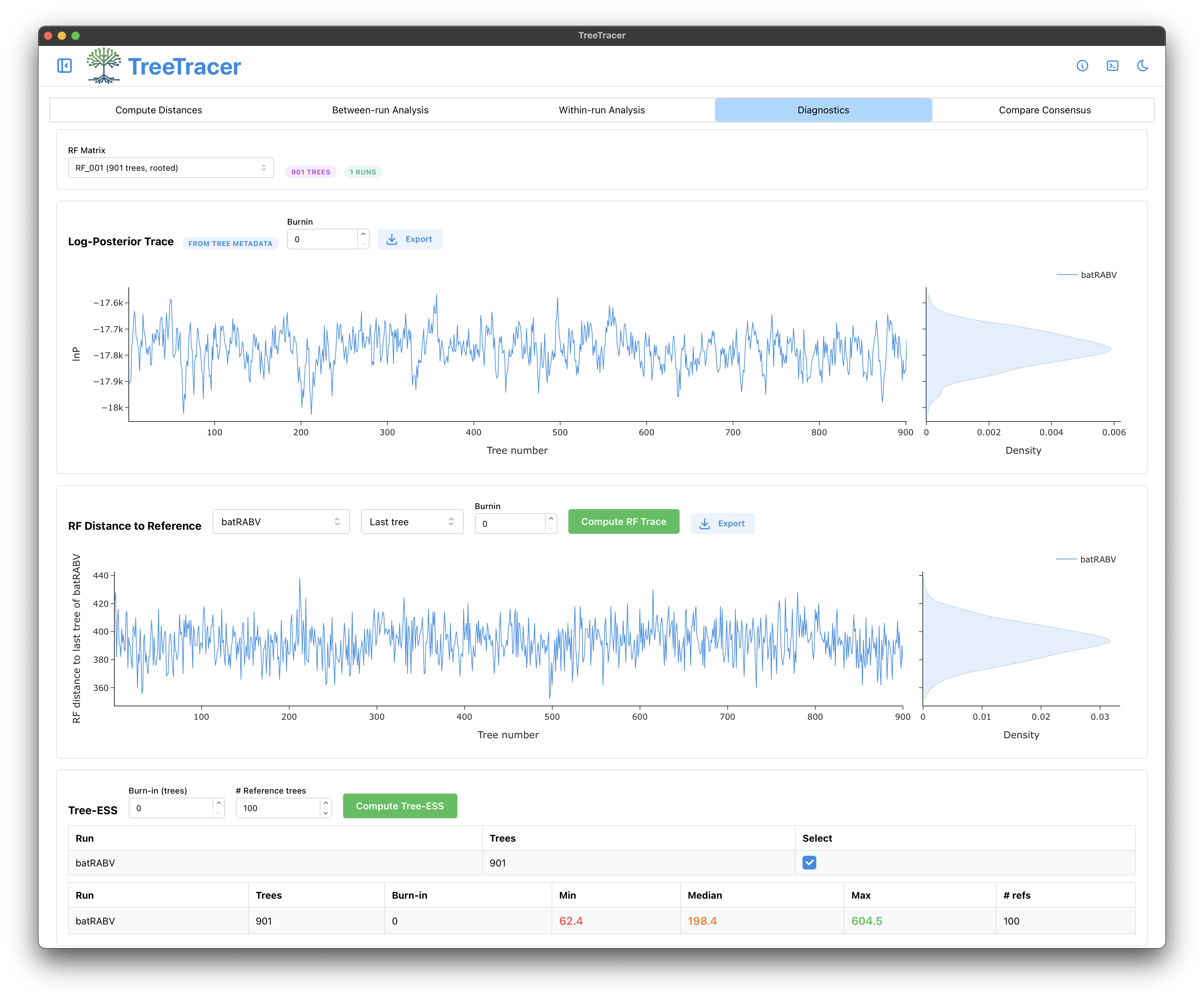
The Fréchet correlation ESS here confirms what we saw for the continuous parameters in Tracer, i.e. that our analysis needs to run for a while longer to yield a sufficiently large number of independent samples from the posterior.
The Compare Consensus panel
Finally, we inspect the Compare Consensus panel where we find our two previously computed consensus trees. We select the two trees in order for the Group 1 (Consensus tree) and Group 2 (Consensus tree) respectively.
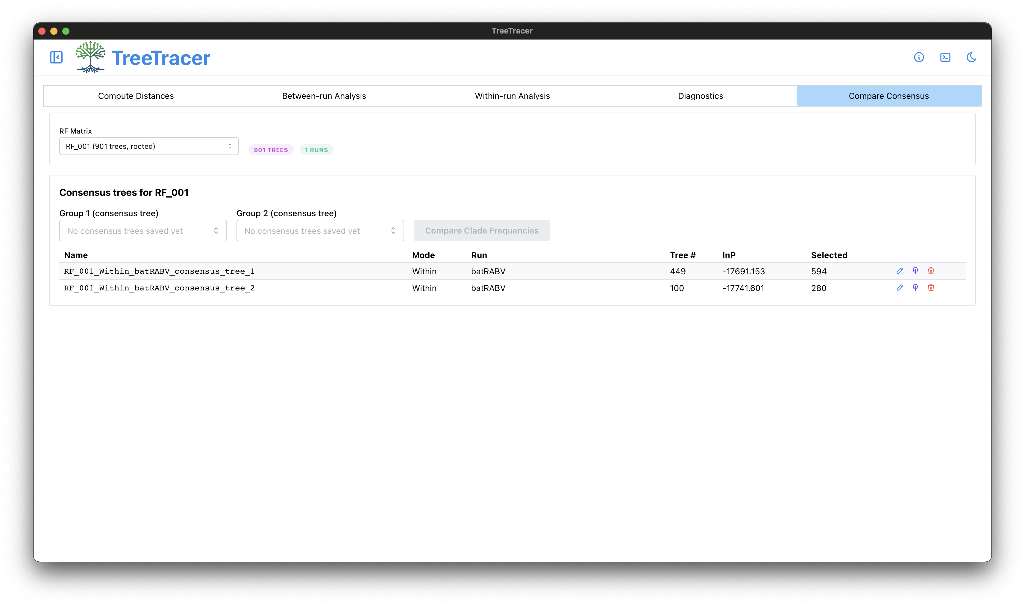
This will enable clicking the Compare Clade Frequencies button to construct a scatter plot of the clade frequencies in both trees.
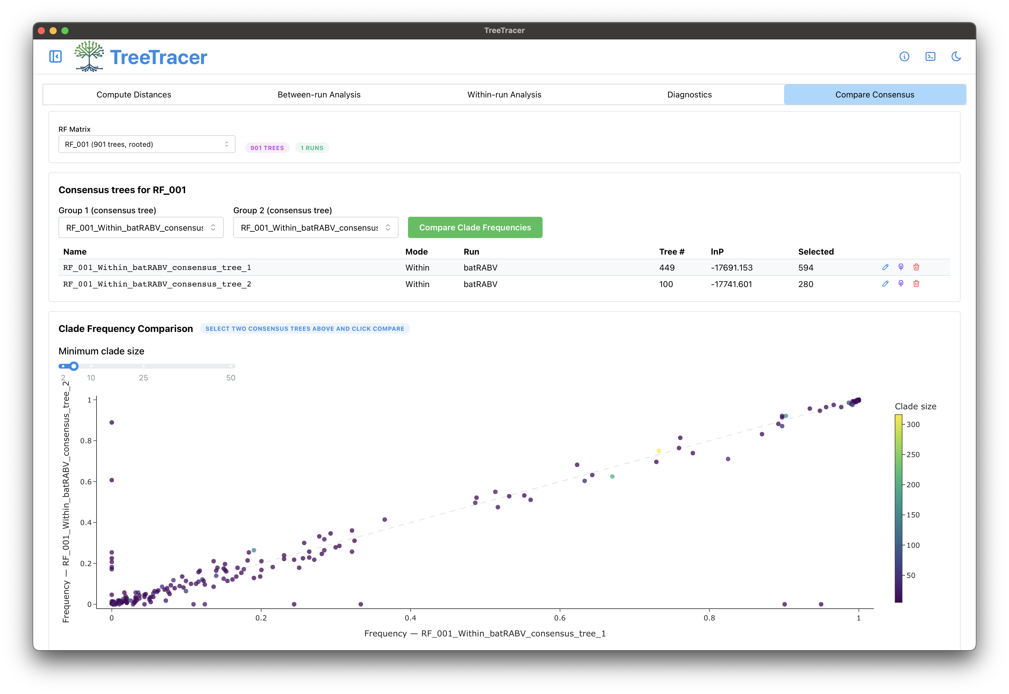
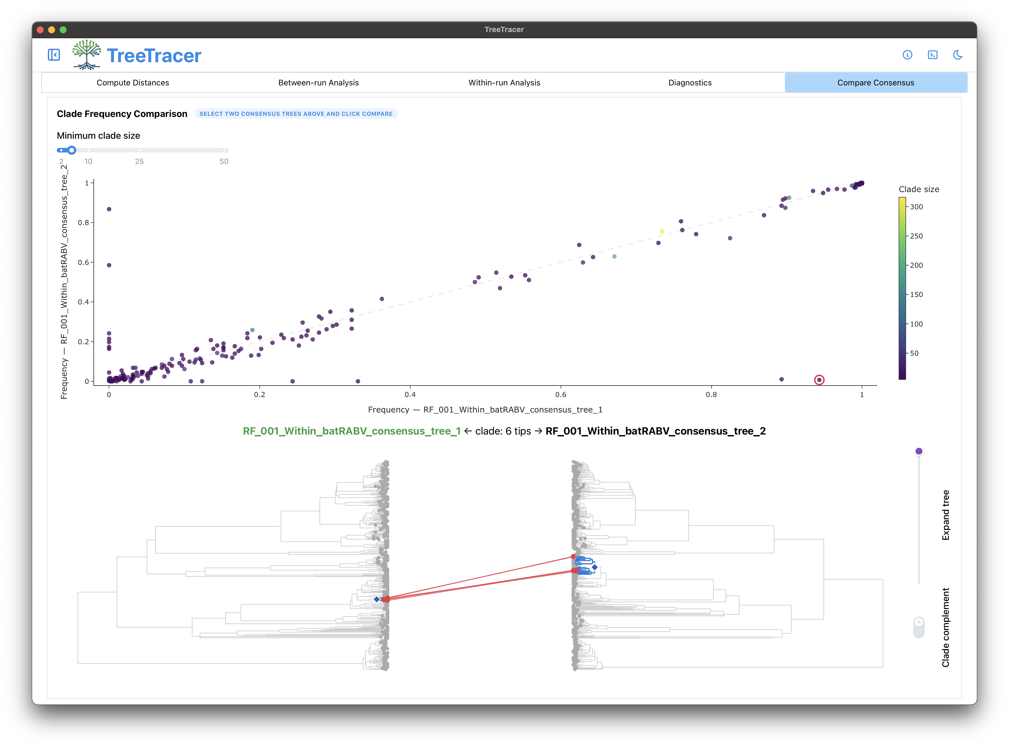
We can now compare the consensus trees - with highlighted clades in both trees - for each point in the scatter plot, simply by clicking one of the points. Of main interest are those clades that appear often in the sampled posterior trees that make up one mode, but rarely in the sampled posterior trees that make up the other mode. To this end, we can select any point close to the X-axis or the Y-axis. The figure below shows such a clade (made up of 6 tips / sequences) that almost always clusters together in the large mode, but never in the smaller mode. These sequences could hence warrant further inspection (e.g. for reassortment, recombination, specific mutations, …); we refer to Gao et al. (2026) for examples of such inspections.
Concluding, in this tutorial we looked into convergence and mixing of the output of a single BEAST analysis (and hence a single .trees file). In a follow-up tutorial, we will focus on comparing multiple analysis replicates to one another to check whether running the same analysis multiple times leads to consistent results.
References
Software packages and analysis methods
Rambaut, A., Drummond, A. J., Xie, D., Baele, G., and Suchard M. A. (2018) Posterior summarization in Bayesian phylogenetics using Tracer 1.7. Syst. Biol., 67(5), 901–904.
Hong, S. L., Brusselmans, M., Klaps, J., Carvalho, L. M., Magee, A. F., Suchard, M. A., Rambaut, A., and Baele G. (2026) Tree convergence and mixing in Bayesian phylogenetics Using TreeTracer. In preparation.
Gao, J., Brusselmans, M., Carvalho, L. M., Suchard, M. A., Baele, G., and Matsen IV, F. A. (2026) Biological causes and impacts of rugged tree landscapes in phylodynamic inference. Proc. Natl. Acad. Sci. USA, 123(2), e2510938123.
Brusselmans, M., Carvalho, L. M., Hong, S. L., Gao, J., Matsen IV, F. A., Rambaut, A., Lemey, P., Suchard, M. A., Dudas, G., and Baele, G. (2024) On the importance of assessing topological convergence in Bayesian phylogenetic inference. Virus Evol. 10(1): veae081.
Magee, A., Karcher, M., Matsen IV, F. A., and Minin, V. (2024) How trustworthy is your tree? Bayesian phylogenetic effective sample size through the lens of Monte Carlo error. Bayesian Analysis, 19(2), 565-593.
Murdoch, D. and Chow, E. (1996). A graphical display of large correlation matrices. Am. Stat., 50, 178–180.
Data set information
Faria, N., Suchard, M., Rambaut, A., Streicker, D., and Lemey, P. (2013). Simultaneously reconstructing viral cross-species transmission history and identifying the underlying constraint. Phil. Trans. R. Soc. London B, Biol. Sci., 368, 20120196.
Streicker, D., Turmelle, A., Vonhof, M., Kuzmin, I., McCracken, G. F., and Rupprecht, C. (2010). Host phylogeny constrains cross-species emergence and establishment of rabies virus in bats. Science, 329, 676–679.
Models used
Gill, M.S., Lemey, P., Faria, N.R., Rambaut, A., Shapiro, B. and Suchard M.A. (2013). Improving Bayesian population dynamics inference: a coalescent-based model for multiple loci. Mol. Biol. Evol. 30:713–724.
Lemey, P., Rambaut, A., Drummond, A., and Suchard, M. (2009). Bayesian phylogeography finds its root. PLoS Comp. Biol., 5(9), e1000520.
Heled, J. and Drummond, A. J. (2008). Bayesian inference of population size history from multiple loci. BMC Evol. Biol., 8, 289.
Minin, V. N., Bloomquist, E. W., and Suchard, M. A. (2008). Smooth skyride through a rough skyline: Bayesian coalescent- based inference of population dynamics. Mol. Biol. Evol., 25(7), 1459–1471.
Drummond, A. J., Rambaut, A., Shapiro, B., and Pybus, O. G. (2005). Bayesian coalescent inference of past population dynamics from molecular sequences. Mol. Biol. Evol., 22(5), 1185–1192.
Drummond, A. J., Nicholls, G. K., Rodrigo, A. G., and Solomon, W. (2002). Estimating mutation parameters, population history and genealogy simultaneously from temporally spaced sequence data. Genetics, 161(3), 1307–1320.